I’ve been experimenting with a variety of design concepts for Oculus Rift environments, and wanted to share one of my unpolished test builds. You can download it here.

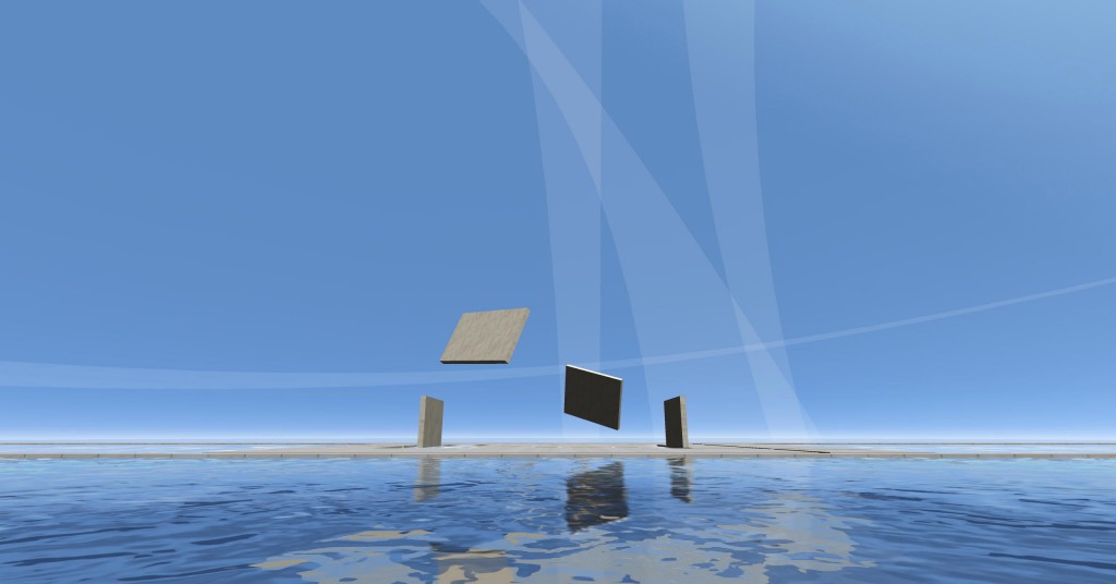
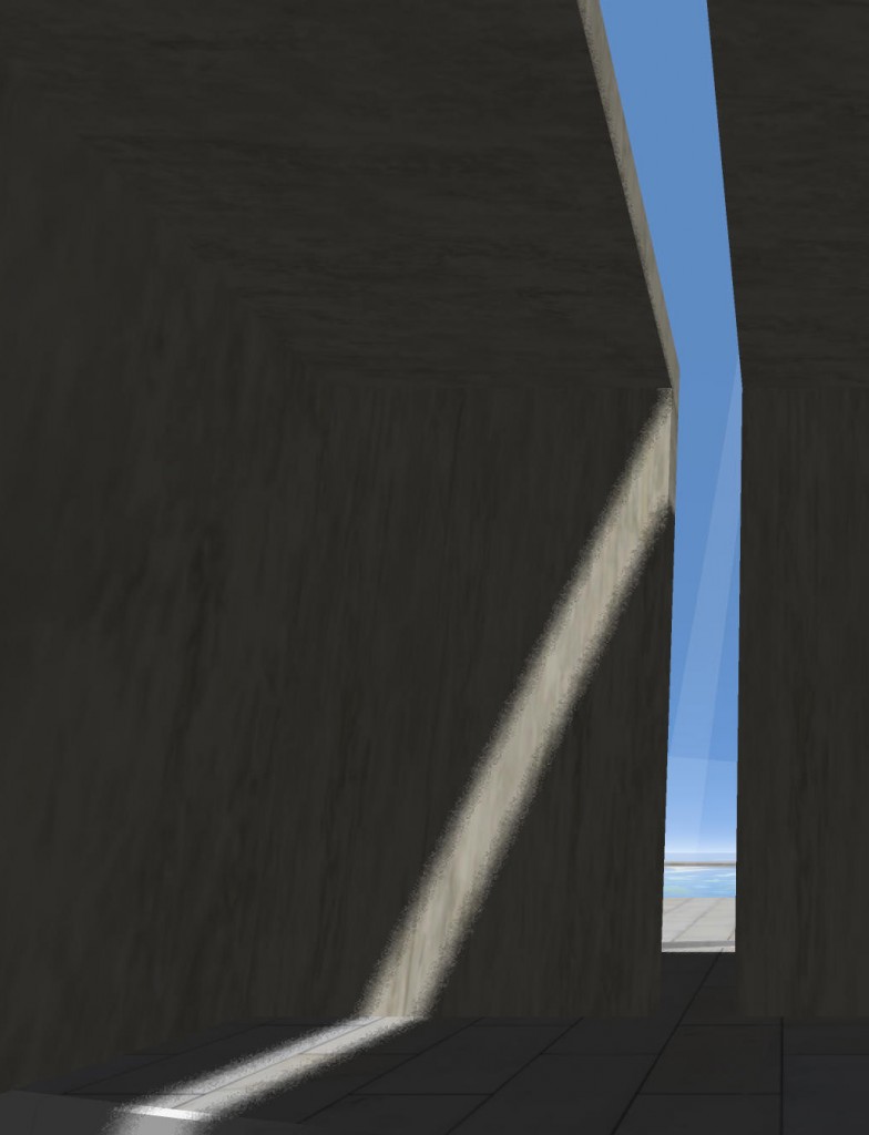
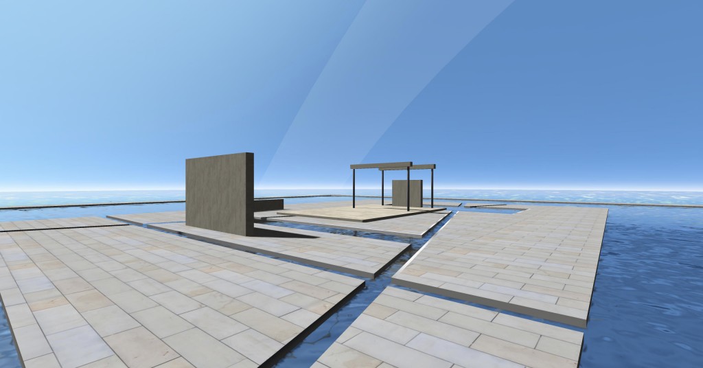
The idea with this build was to explore ways to accentuate the sense of presence, and the perceived ‘weight’ of materials by making the architectural elements dynamic. In this experiment, wall, roof and column elements slide and fly through the air, variously coming together than falling apart to define different spaces and forms.

In my next experiments, I’m thinking of making the animation sequence a bit less chaotic and more about a sequential assembly of pieces to form a cohesive composition at the end. I’d also like to think more about the player’s movement through the space, perhaps by introducing a subtle indication of a path with designed experiences triggered along the way, rather than this open ended space. The distant arching elements in the sky work well to add some distant interest, so I might work a little more with that – perhaps different curving shapes, different color/materials, maybe a subtle scrolling UV texture, etc. A middle-ground piece might also do well to compliment the foreground and background elements.

I’ll probably kill the birds too, and time the whoosh sounds more closely to the movement of the slabs.
Either that, or I’ll just call it a day and start working on a completely different concept. 😉

