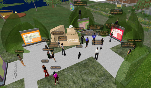
Chris Luebkeman’s presentation on Autodesk Island was quite a unique experience! During event preparations, Chris described an idea for creating a more engaging presentation than the formal theater-style build where the audience experiences the event in a passive role. Instead, we opted for a more dynamic installation where attendees were encouraged to move around the build as Chris described each of the 5 Drivers of Change categories.
Chris also wondered if the architecture of the installation itself could reflect a metaphor of the dichotomy between natural or organic systems, juxtaposed against a more rigid, or linear element. As a result, a series of linear or orthogonal kiosk elements are nestled within a hull made of leaf-textures that open when an avatar approaches, and closes when the avatar leaves. This kind of ‘reflexive’ or organic architecture is a concept I’ve been looking forward to exploring, and this installation provided the perfect opportunity to test it out. While this application is fairly subtle, I think the idea of reflexive architecture has tremendous potential for virtual architecture… more on that soon! =)
The event started with Chris (avatar Leubke Mannonen) and Autodesk moderator RevitQueen Oh sitting on top of a virtual replica of the Drivers of Change box that typically serves as a give-away during real-life presentations. In this case, the box contained a HUD, created by Kiwini Oe of Clear Ink, that enables visitors to read more about each category.
As Chris described each category, he moved from kiosk to kiosk, sometimes sitting down or standing on top of the kiosk as he spoke. This kind of dynamic movement throughout the presentation made it far more engaging and interactive than the typical hierarchy of audience and presenter. I think Chris did a fantastic job, and it was a real pleasure to have been able to work with him on this event, and hopefully many more in the future!
