During the past several months, I’ve had the privilege of working with Gronstedt Group and their clients at Avaya on a variety of immersive learning, training and workplace environments. Projects included 2 full campus areas, complete with library, auditorium, office and training spaces. These projects were realized using Avaya’s own AvayaLive Engage multi-user platform (formerly web.alive).
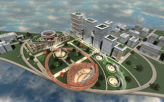
Autodesk Maya was used to model the environments, along with Unity3D to quickly prototype illustrations before they were imported into AvayaLive Engage.
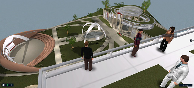
One of the best features of the Engage platform is their robust voice communication, web integration and screen sharing between avatars. Entering the virtual world and using these features is seamless and intuitive, and even new users logging in for the first time rarely had any difficulty getting voice communication to work.
The back end of the AvayaLive platform itself, built on an older version of Unreal Development Kit (UDK), proved to be somewhat challenging, but the security and accessibility of the platform, along with the communications integration offset those challenges by far.
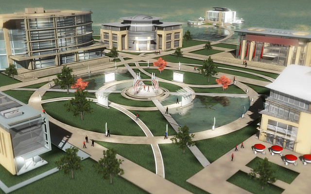
It was important from the very beginning to balance function, navigation and architectural style. Before a single line was drawn, the idea of calling it a ‘campus’ already evoked a perception of the space, and the urban and architectural forms grew from there. Both campuses feature a large central courtyard, bordered by buildings, landscape and paths.
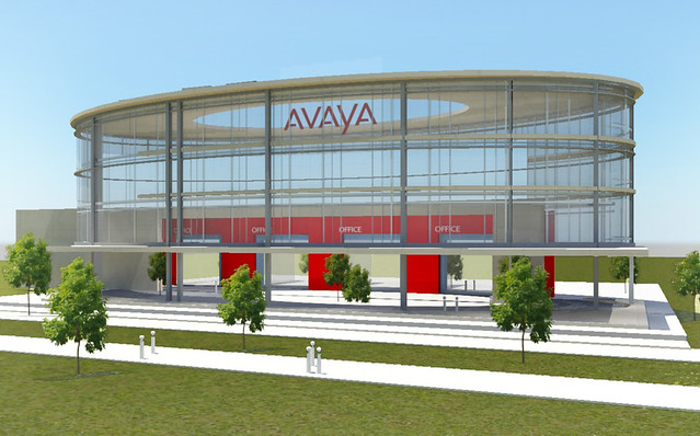
Client and user preferences around architectural style often range from traditional to highly modern. Because this space will be accessed by a large cross-section of employee and client users, most of whom have never used a virtual world before, it had to feel relatively familiar and easy to navigate. Pushing too far in a futuristic ‘virtual’ style direction can make users feel uncomfortable or disoriented. To balance this, I designed a fairly traditional modern exterior shell for each building that wouldn’t be out of place in the real world, then took liberties to detail the individual buildings as much more open air, glassy, modern interior spaces (see above illustration) where the building form is used to minimally delineate functional spaces that are easy to find, easy to use and easy to navigate with expansive views outdoors to landscaping, water and sky.
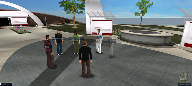
The buildings, in some cases, serve as more of an icon or placeholder, rather than a complete architectural interior environment. In those cases, the lower level lobby space includes teleport kiosks accessing various configurable color-coded levels above, along with access to a roof terrace on top of each building that overlook the campus below.
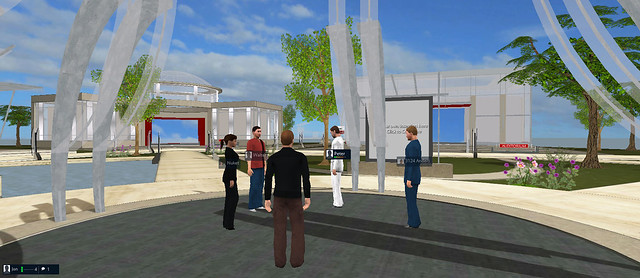
The use of these natural elements like sky, trees, flowers, and water may seem superfulous in a virtual environment, yet I’m always amazed by just how important they really are to how visitors feel about the space. Testing this build before the landscaping, water and skybox were installed had a completely different feel to it – much less inviting, and so much more dull and lifeless. Nature, it seems, is as important in the virtual world as it is in the real world.
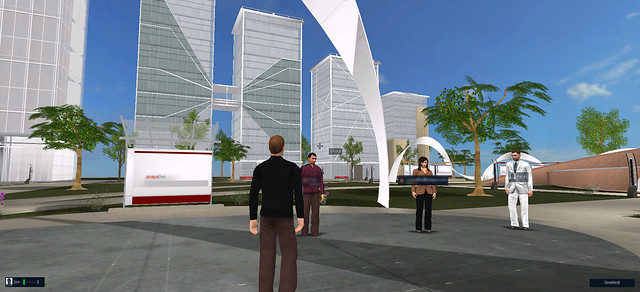
I would highly recommend AvayaLive Engage for any enterprise or education project where fluid and easy to set up voice and web collaboration is a top priority. I would also recommend contacting Gronstedt Group if you’re considering a virtual training or workplace collaboration environment. Over the past several years, they have developed a steady stream of high quality, thoughtful and well planned virtual environments, along with a solid workflow and highly skilled team of developers.
For more information about how your organization can leverage the AvayaLive Engage environment, get in touch with the Gronstedt Group here (link).